Our Top 5 Go-To White Paint Colors
Sarah Elizabeth

When we are decorating apartments and homes in New York City, our fail-proof white paint colors consist of Chantilly Lace, Super White and Decorators White, all by Benjamin Moore. One of them always does the trick as they all support and compliment bright colors when used on trim (for all those vibrant kids rooms where we really got to have fun with color!), to the art collectors who need a trusted backdrop to let their collections speak for themselves. Yet, as we expand to do more interior design work in New Jersey, aka the burbs, we have developed a trusted batch of white paint colors that you simply cant go wrong with.
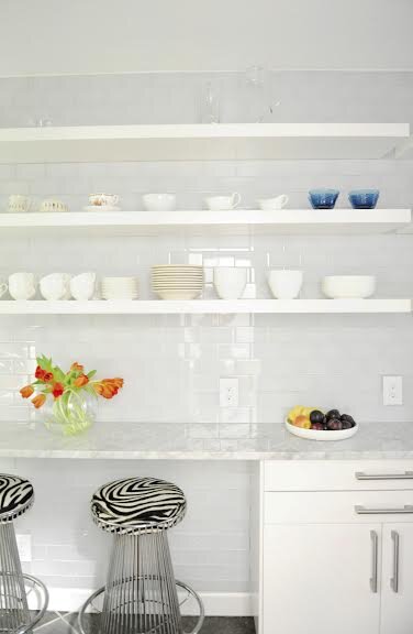
Here in an upper west side Manhattan kitchen renovation, we used Super White by Benjamin Moore as the new kitchen had so many modern elements, that a clean white worked.
What in important to keep in mind when choosing paint colors is how the outside and even inside affect a paint color. In New Jersey for example there are lots of trees and greenery (at least for half the year!) and that green will influence the color of your walls and give them a slight greenish hue. This can happen with vibrant furniture in your room and even the light bulbs you choose, casting a warmer or cooler (blueish) hue on the walls. That said, unlike a handful of other whites we love, these 5 colors have been able to stand up to most externals and have become our tried and true whites to work with.
1. White Dove by Benjamin Moore - You might know it and have already been using it but if not I hope this is an AHA moment for you! Eureka, you found it! We use it on walls if you have at least (some) natural light coming in, and religiously on trim and built-in cabinets. It is more soft than Super White, with dare I say the slightest hint of grey in it, though its not noticeable, its just softer than the clean whites while not bringing in any other colors, as other whites do for example Simply White which i’ll get to next.

Shown here White Dove painted on custom built-in cabinets we had installed this week, and couldn’t be happier with the paint color!
2. Simply White by Benjamin Moore - Now this color may not be for everyone and thats because unlike the White Dove, this one does have a touch of yellow in it, or as like to put it, a touch of sunshine. We use this in bathrooms that have little light, as well as laundry rooms and any rooms on an angle where they dont get much natural sunlight, as this color brings the sun with it. Its so subtle that you cant tell its not a clean white unless you look at it near the ceiling (we normally do ceilings in Benjamin Moore Decorators White) where you can see that warm to it compared to the DW.

Here we used Simply White to lighten a dark master bath that had just one small window in it.
3. Pointing by Farrow and Ball - We love this color for the same reasons as we love Simply White, its a white with depth. As it has a slightly more creamy tone than the others, its great for transitional and more classical homes, and looks amazing on trim, doors and molding. We love using it when Benjamin Moore Linen White is a is too dark.

Here we used it in a bathroom renovation that previously had dark cream-colored walls where we wanted a more flattering, lighter color without being too stark.
4. Wimborne White by Farrow and Ball - Now this color is much closer to the clean whites I mentioned at the beginning, yet there is a slight warm and versatility that makes it the perfect color for trim in our transitional projects where we want to lighting things up. This color is clean, sophisticated and our go-to for trim especially if we are using a colorful pallet, or on walls in more modern projects.

We used it here for the trim to help the powder pink walls really pop, whereas if we’d used a cream this modern home office would have had a much more traditional feel.
5. Swiss Coffee by Benjamin Moore - I think of this color as just the way the name sounds, a light cream with mood, depth, and a ton of warmth. This color has the most pigment of the whites I’ve named yet it is versatile working with both browns and greys, and can be used on walls or trim successfully, and is a popular color for kitchen cabinets. That said, I do think of it as a transitional color and would not do it in a modern home, but one with classical moldings, trim and perhaps chair rails.

Here Swiss Coffee was used on the walls, adding a subtle warmth and glow to the space. Image via Studio McGee.