Going Beyond The Latest Color Trends
Sarah Elizabeth
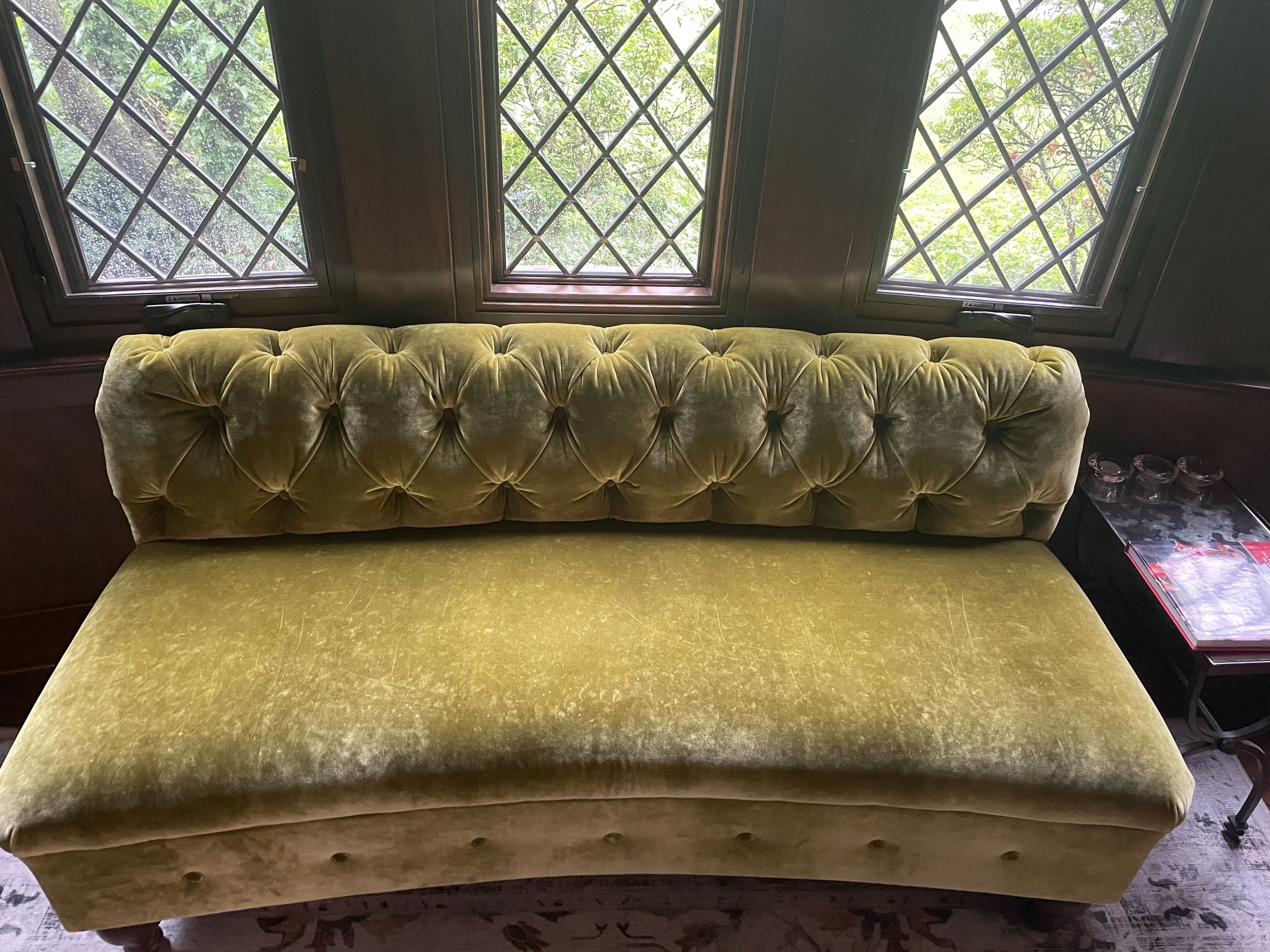
When explaining the design direction of a new project I found myself telling my assistant that we will be using greens and blues, “but please NO forest green”. I was struck by the conviction in what I was saying, that forest green is trendy, and that I do not want it used in our future projects, as it is not rooted in classicism, but rather just a trend. As you have most likely noticed, everyone from big box stores from West Elm to Wayfair, has a forest green (normally velvet) color option in their quick ship furniture line. The idea is not to avoid color trends, if you are drawn to them, but to look beyond them at other colors that will withstand the test of time rather than out of place in a few short years. More importantly you want your home to represent you, and not look like other peoples homes. Seen below is a kiwi green velvet we opted for, for a custom designed dining room settee.
Mauve is right behind it. Don't get me wrong, Ive never seen a pink I didnt like, a testament being a project where I clad a New York City living room in mauve from walls to ceiling (seen below) but that was 8 years ago, when it was not a trend nor a well known color. Since then I have designed a half dozen home offices in some shade of mauve, but as it became the hype we moved away from it into deep powder pinks that are more sophisticated, without feeling like children’s room colors. The same can be said for navy blue (think navy blue kitchen island trend) but I digress.

I understand the draw toward these shades and people craving them especially during the pandemic, pinks bring us back to the heart, they literally represent love, and make people feel this, while deep greens remind people of the outdoors and nature, which are all wonderful things. Dont get me wrong, I have not met a color I didnt love, but I beg you to look outside the box and to other colors, even similar, rather than following the trend. You would not want to look at your ‘home in 3, 5 or even 7 years down the line, and think, oh that was “pandemic mauve” for example, or for you or guests to be able to label a year or period to your homes aesthetic.
The third color I keep thinking we have finally moved beyond for obvious reasons are shades of grey, especially during the pandemic - as they can literally make you feel down, as they are normally void of any warmth, or feeling, and yet they keep popping up… My feeling is unless you're a chic Parisian aristocrat type with a Hassman-era pied-a-terre on the Sienne, with an heirloom art and antique collection to boot, or simply a true master of color, chances are you may not be able to pull off greys anymore. A classic case are homeowners selling their homes and advised to paint the walls in various shades of grey. Fast forward to when we are brought to design the home for the new home owners, and they have to pay to paint every room in the home having us create a new color palette - to undo the sellers outdated color choice. Many realtors I've been told are still suggesting greying out your home before selling to which id suggest simply painting the interior white or light ivory, more on our paint guide blog post.
Below is another example of one of our projects with two gorgeous emerald green velvet chairs we had made. We initially shopped for deep forest green velvets, mostly as that was what was flooding the market, and offered from our fabric vendors alike, but something just didnt feel right - or original. Once we pivoted to emeralds which were more rare, and took the time to seek them out, hunting to find the perfect shade, the room became special, looking and feeling more purposeful, and unique to our client and her family. We have been asked countless times where we bought those chairs (if it were only that easy).

I'm not saying to simply avoid the color trends, but instead look to similar colors that you may find you are drawn to, for a more personalized, true representation of you and your homes taste and style. For example instead of mauve you can look at the spectrum of flesh tones whereas most have a pink undertone, or sophisticated pinks as mentioned above. Instead of opting for grey walls (for either selling - or staying in your home) don't be afraid of light creams, sand tones, and pale yellows. Uttering the word yellow for interiors sadly has a stigma (think your great aunt Ema’s home that seems a time capsule) but it can be beautiful in subtle hints making a room feel more light-filled as the yellow tint acts as sunshine in a room with low light like rec rooms, basements or north facing rooms. Below we developed a palette of sand tones, using a light cream color for the moldings and mantle, creating a timeless, opposed to trendy, space.

If you don't have confidence in color you cant go wrong with white, or light cream tones for walls as mentioned above, as you can always paint them a color later as I tell new home owners. Then using a designer to direct you in a color palette for your furniture to move outside of the current color trends, into what is more authentically you, and designed to last beyond the trends forecast.