Wallpaper 101 and how to choose whats right for your home
Sarah Elizabeth
Wallpaper is can be a very personal choice and is not for everyone, or every home. But when its used and done right, the impact it makes, and feeling it evokes can be magical. As it can feel daunting when choosing a wallpaper, now that the wallpaper vendors have multiplied with countless online companies offering eye-catching designs, we have put together a step-by-step guide on how to choose your wallpaper AND where to place it.
#1: WHATS YOUR WALLPAPER STYLE AND VIBE?
Fun, bold and bright? Look for high-chroma colors like pinks and greens paired together in oversize patterns (think Andy Warhol Flowers!). You can do fun, bold patterns, or something with lots of movement like a marble pattern thats so hot right now.
Glamorous: Think patterns with metallics, or a pattern with sparkle, some papers even have glitter on them. Look for patterns with texture, flocking is certainly back and paired with brocade it can be very glam. We have even opted grasscloth or natural fiber wallpapers with metallic threads running through them to give rooms that glam-factor.
Tranquil and Zen-like: If this is what you are trying to achieve in a room, look for tone on tone, and a subtle pattern without much movement. It could be a floral in sand-tones with a slightly darker background, or that same scenario in a blue palette or green palette. Grasscloths and natural fibers are also an easy, fool proof way to achieve this look within a space. The below wallpaper was carefully chosen in a sand color, with a very subtle shimmer, whereas the adjacent walls were painted a similar color but not exact so that the statement is still the stunning yet tranquil mantle and fireplace wall.

#2: WHERE DO YOU STICK IT?!
An accent wall is a great way to add pattern IF you have a wall for it. Normally a headboard wall in a bedroom, stairwell wall, a side or back wall of your dining room especially if you have an open kitchen and dining concept, or the longest wall if the wall doesnt have too doorways and/or windows. If there isnt a clear transition between one wall and the next, thats not the right way to accent and may be best, in many cases, to do all 4 walls. Normally we can walk into a home and know right away which wall(s) can use wallpaper, but its not so clear for everyone. The below hallway has wallpaper on the walls you see only, the adjacent walls were painted the color of the wallpaper background and blend beautifully. The reason the other walls are not papered is because there are 4 doorways believe it or not, eating up most of the other walls, so the bird pattern would be too cut up, and less impactful, thus paint was the best choice.

All 4 walls in a room can work if the wallpaper isnt too busy (unless that is the look you are going for!) and works well when a room has wainscoting, doorways and windows, and other architectural features that break up the pattern and create interest. The trim color on the molding and/or wainscot is something that you will also want to nail, to compliment the wallpaper but we will save that for another post!
Using the ceilings as the 5th wall is important to enhance the design of, and complete a space, and I have always opted for wallpapering a ceiling if its just not perfect on the walls, OR, like in this pre-war New York City apartment, if you are creating an environment where we bring the outside in, or want the eye to travel. This hand-painted water-color like wallpaper design gives the feeling of clouds and adds movement, drawing your eye across the room and out the window to in this case, the beautiful museum that happens to be right across the street = major focal point AKA million dollar view.

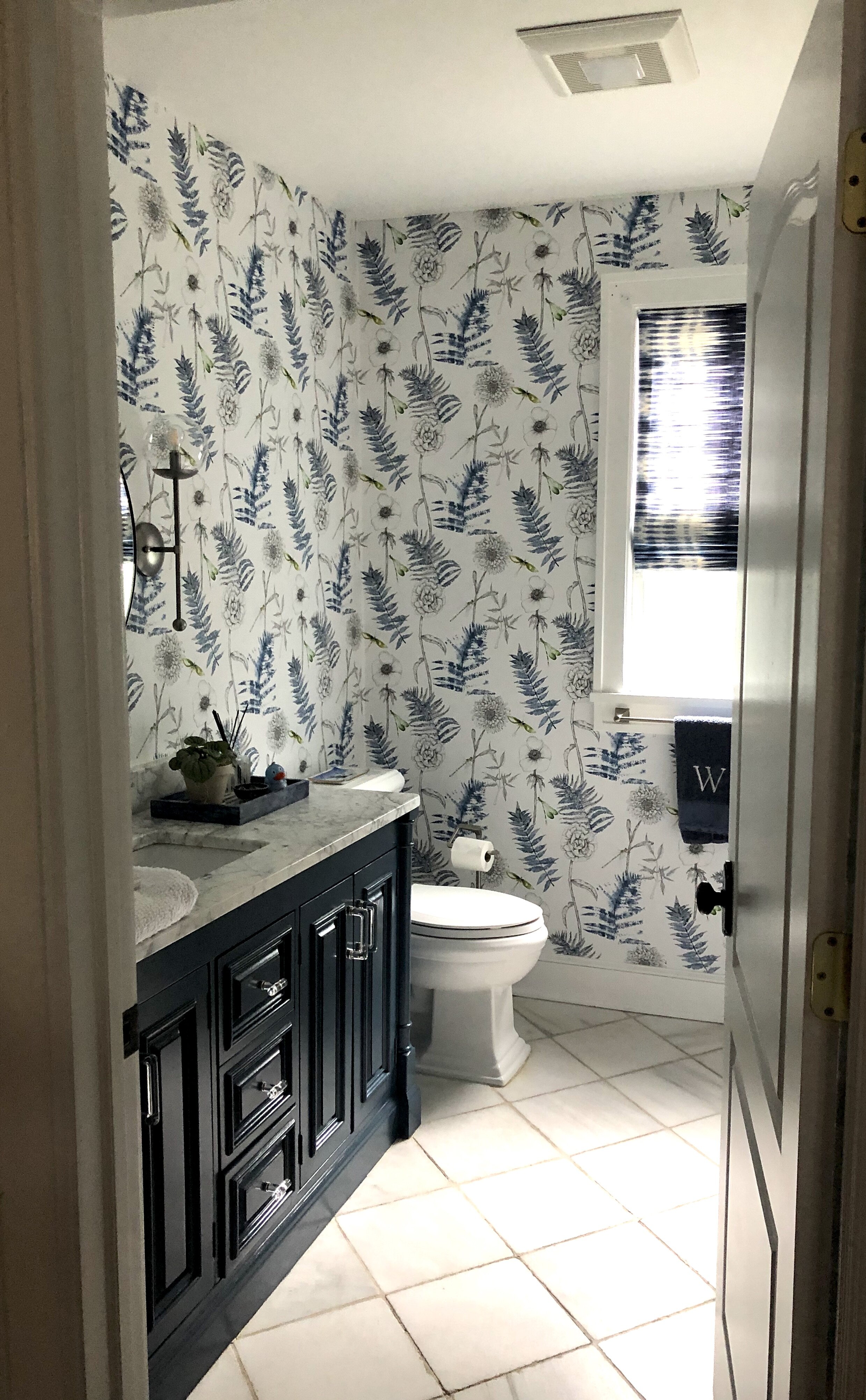
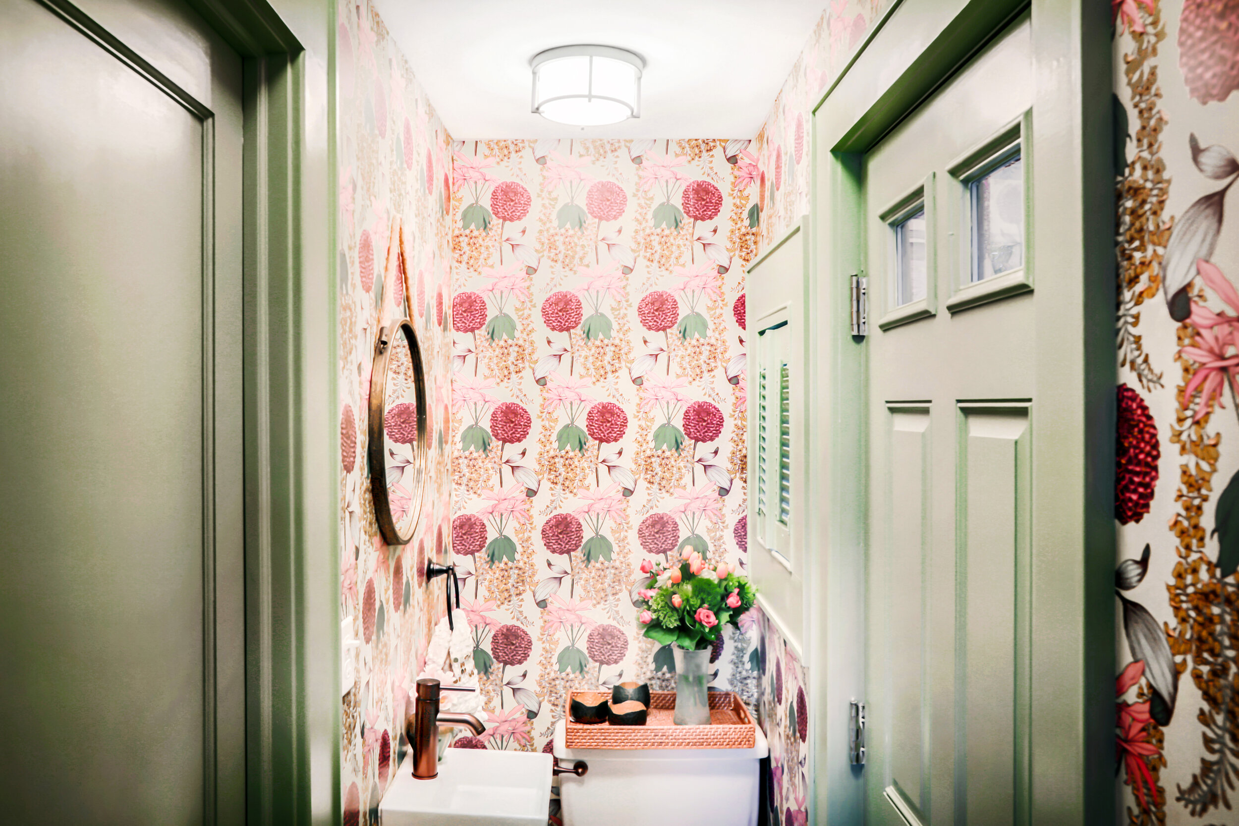
#3: THE SIZE OF THE WALLPAPER PATTERN MATTERS:
So a common rule in design I learned while in interior design school, and will never forget is: Only once you learn the rules can you break them. I mean, lets really leave that to the pros, as they can, and will be major (did i say costly?!) issues when you try to bend the rules without a strong design sense (and degree!!)
This rule applies big time when considering pattern size, as the general rule is that you use a large-scale pattern for a large room (or long wall) and a smaller-scale pattern for a smaller room (think laundry or powder room). Larger scale wallpaper include any murals, whereas you must always check the heights of walls before ordering a mural to make sure nothing in the scene will be cut off if your wall is too short for example - seems like a simple concept, but it does happen… The reason the above rule is so important is if for example you use a small pattern (say small black and white hearts for example) on a long wall, the pattern tends to get A.) lost and wont be seen unless you are relatively close to it and B). can sadly make you feel dizzy when you enter the room, and have several known cases where a homeowner had to strip wallpaper after seeing the dizzying effect in a narrow hallway, or powder room (and called us in to help them re-chose which was costly for them). Many of our clients have expressed that they dont want their rooms to look like an “acid trip”, totally get that, and dont want that either, yikes…!
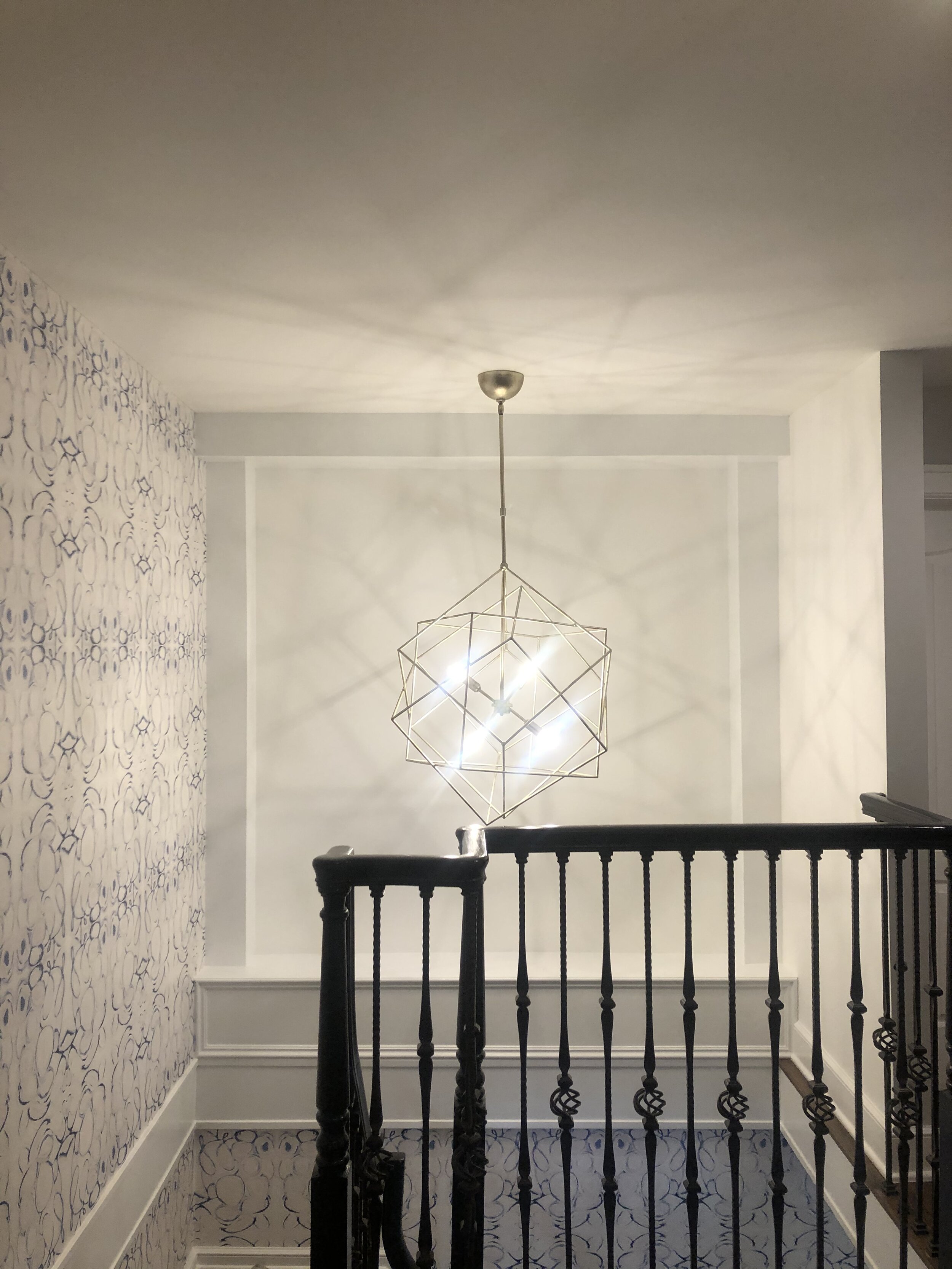
This large-scale pattern below works beautifully for this double-height stairwell and begins at the base of the stairs (not shown) and ends on the second floor, for a dramatic look combined with the 3-foot chandelier. The back upper wall showing was painted bright white to be the backdrop of large scale artwork (photo taken before it arrived!).
This below pattern works beautifully as its proportional to the room, whereas we used a dusty pink paint color for the sloped ceiling to flank the wallpaper walls and white-washed the teak wood trim.

#4: MORE PRO TIPS:
Dont rush it! Before committing to a wallpaper make sure to order not one but a few samples of the wallpaper pattern. Tape them up on the walls you plan to hang them on, and live with them for a few days (or more!) before committing to one!
Do not be afraid of temp wallpapers. They now come in removable peel off options, but the impact is the same as permenant papers - its just gotten more convenient for renters, growing kids, offices and commercial spaces.
The difference in the pricing of wallpapers doesn’t necessarily mean one is better than another, or higher quality etc. We have been told by trusted vendors that sometimes designer patterns are just more pricey. We do use many artisans who’s designs are only offered to the trade and they make small batches of their wallpapers so their overhead and printing fees may be more - part of what makes them so special. It really comes down to choosing the pattern you love most.
Do use a wallpaper hanger. Get recommendations, but leave it to the experts to safe time, frustration, and even money. Once you give them the size of your wall(s) and the pattern you will use, they will tell you the correct amount to order, and you will have the piece of mind that the wallpapers installed correctly.
When in doubt, hire an interior designer. When my design company has the capacity, we are happy to consult on smaller jobs that may take just a few hours or a few visits, like choosing wallpaper for a few rooms, and the bonus is we provide paint colors for trim and other areas that go with the designs, and share so much other design advice to finish your rooms, so you are left with beautiful result that last for years to come.